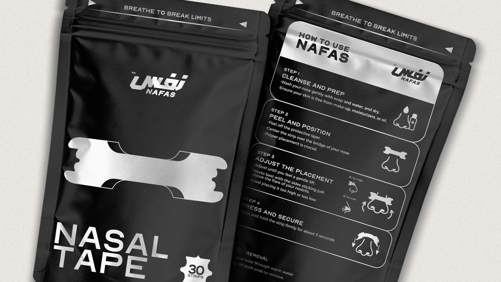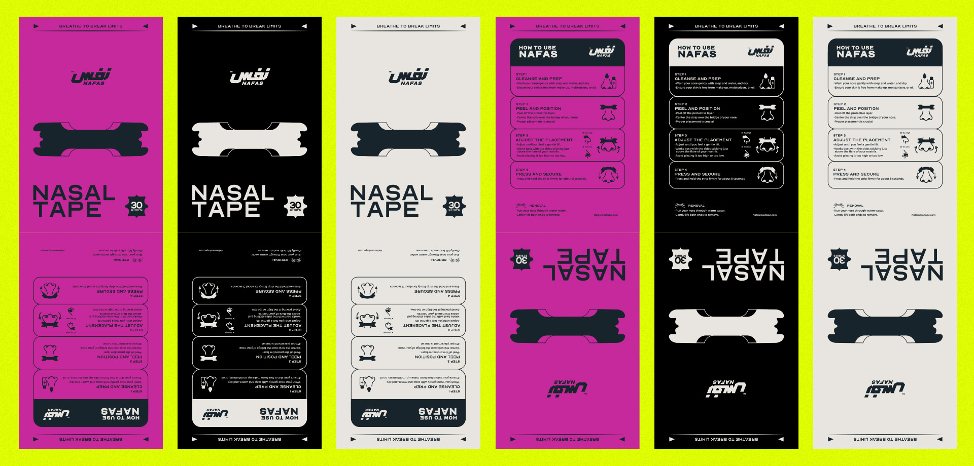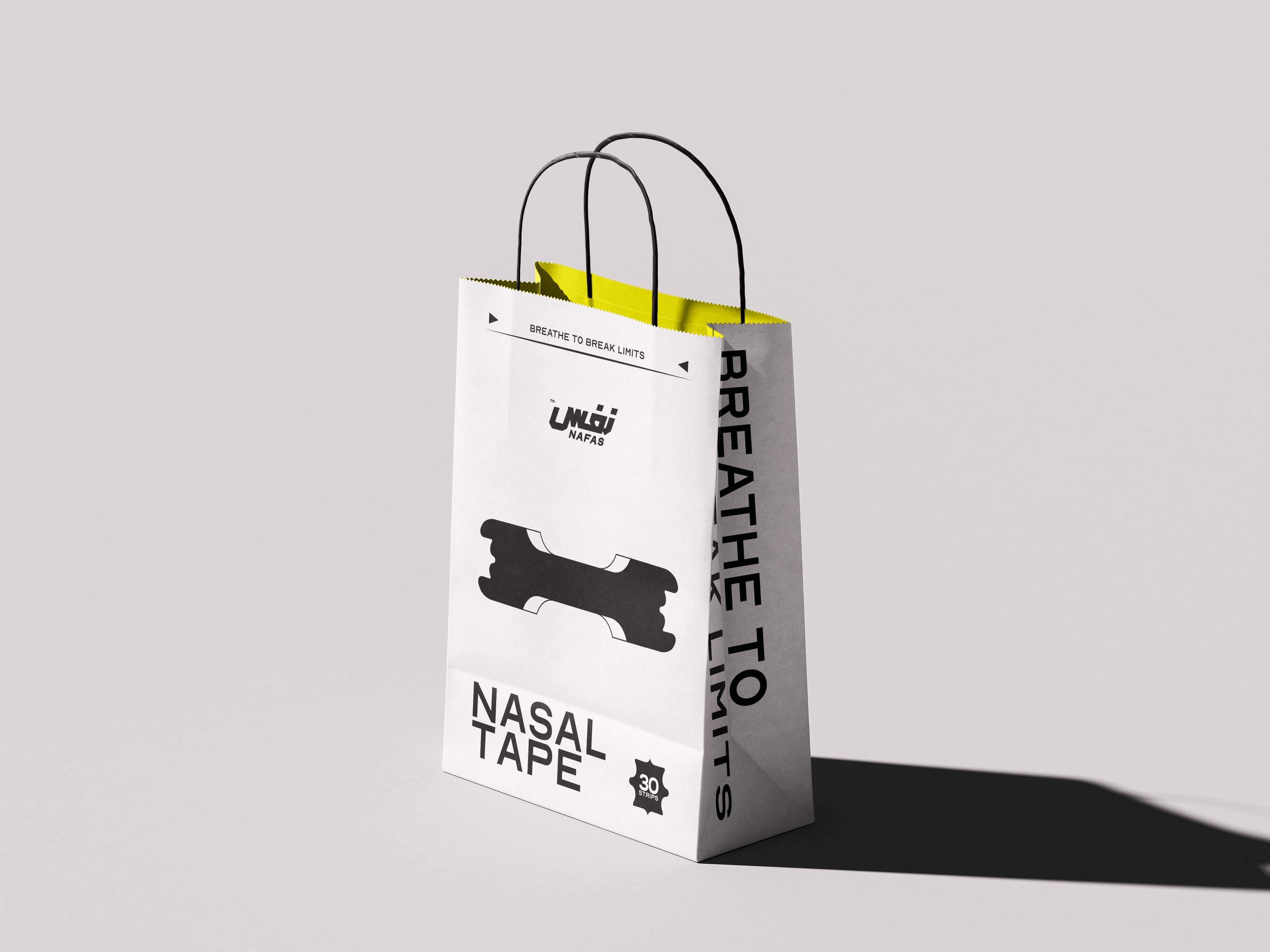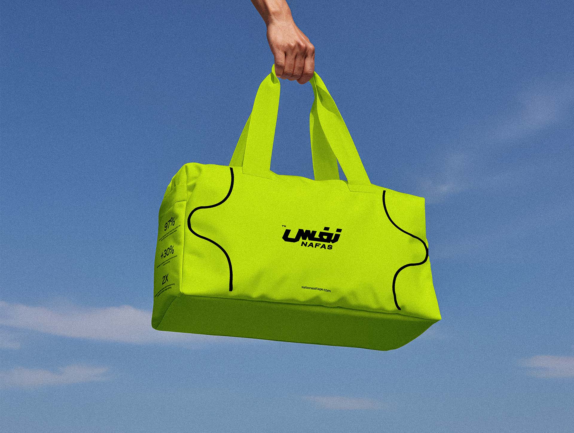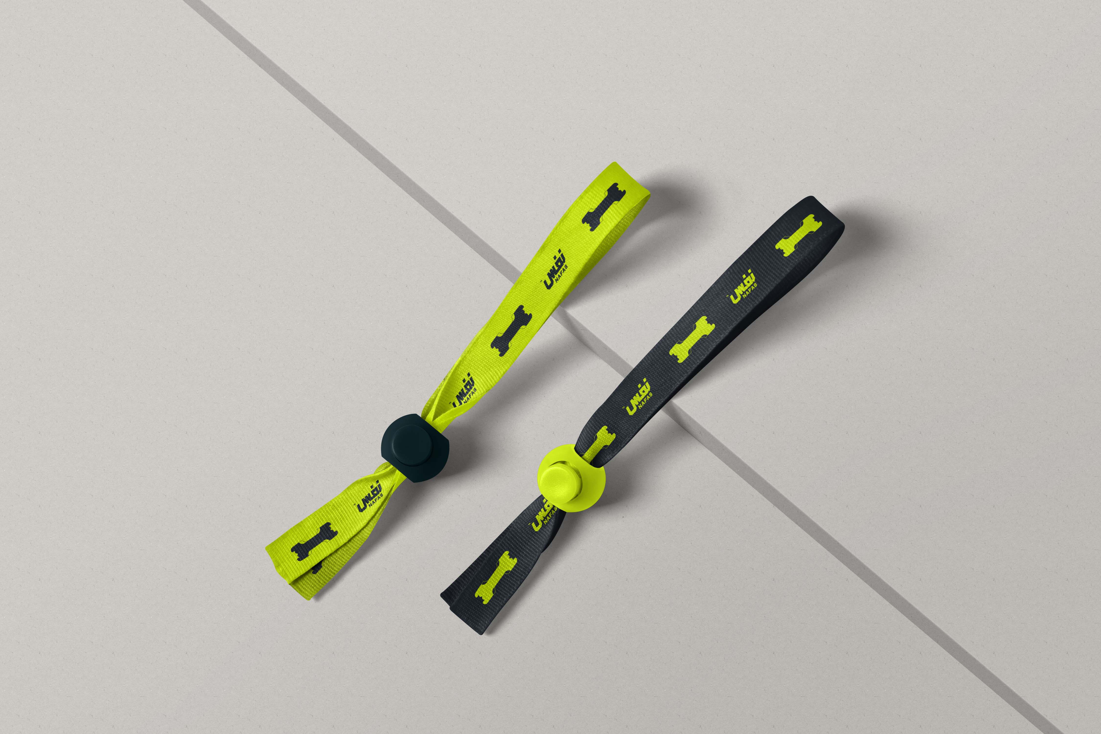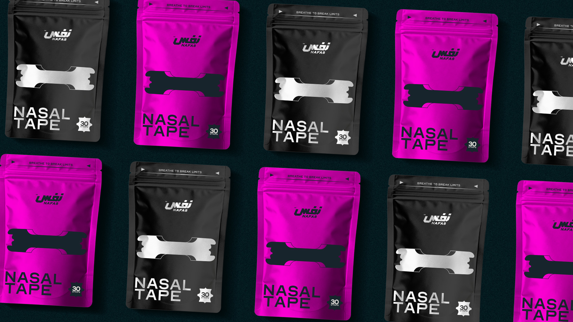

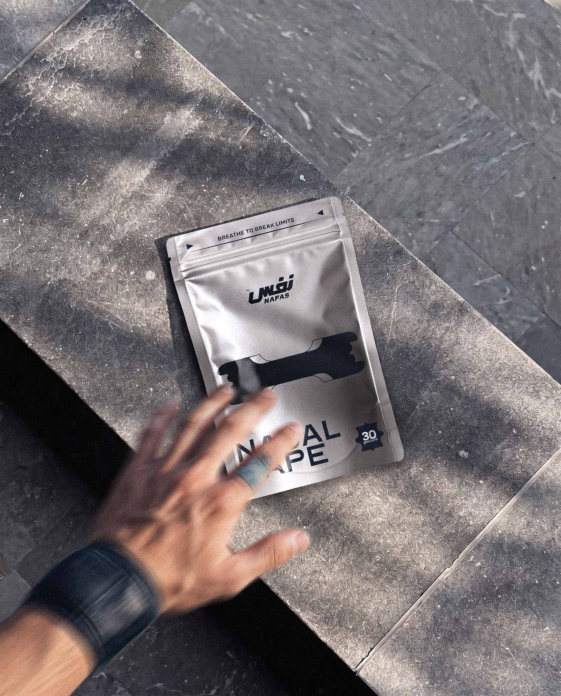
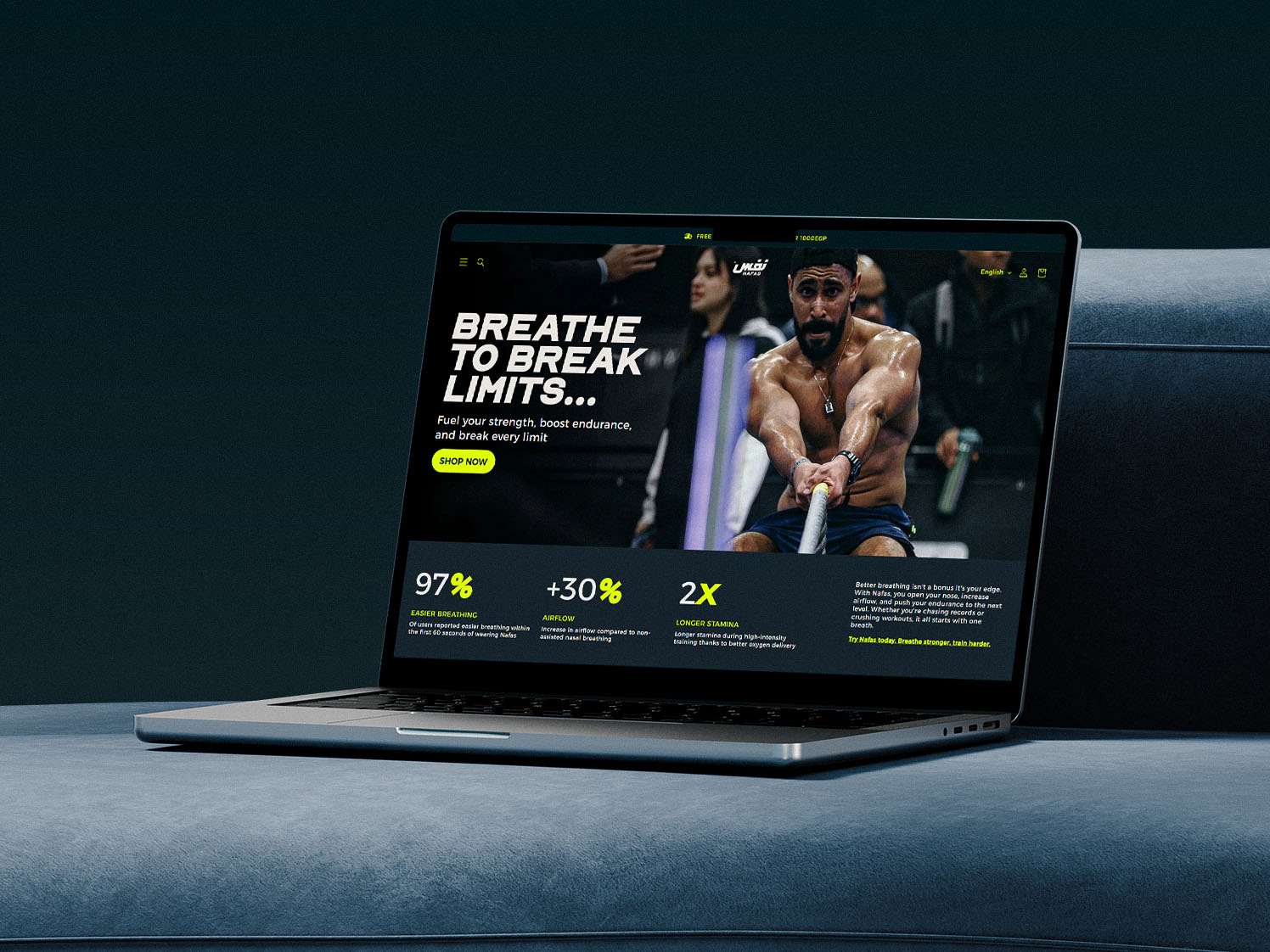
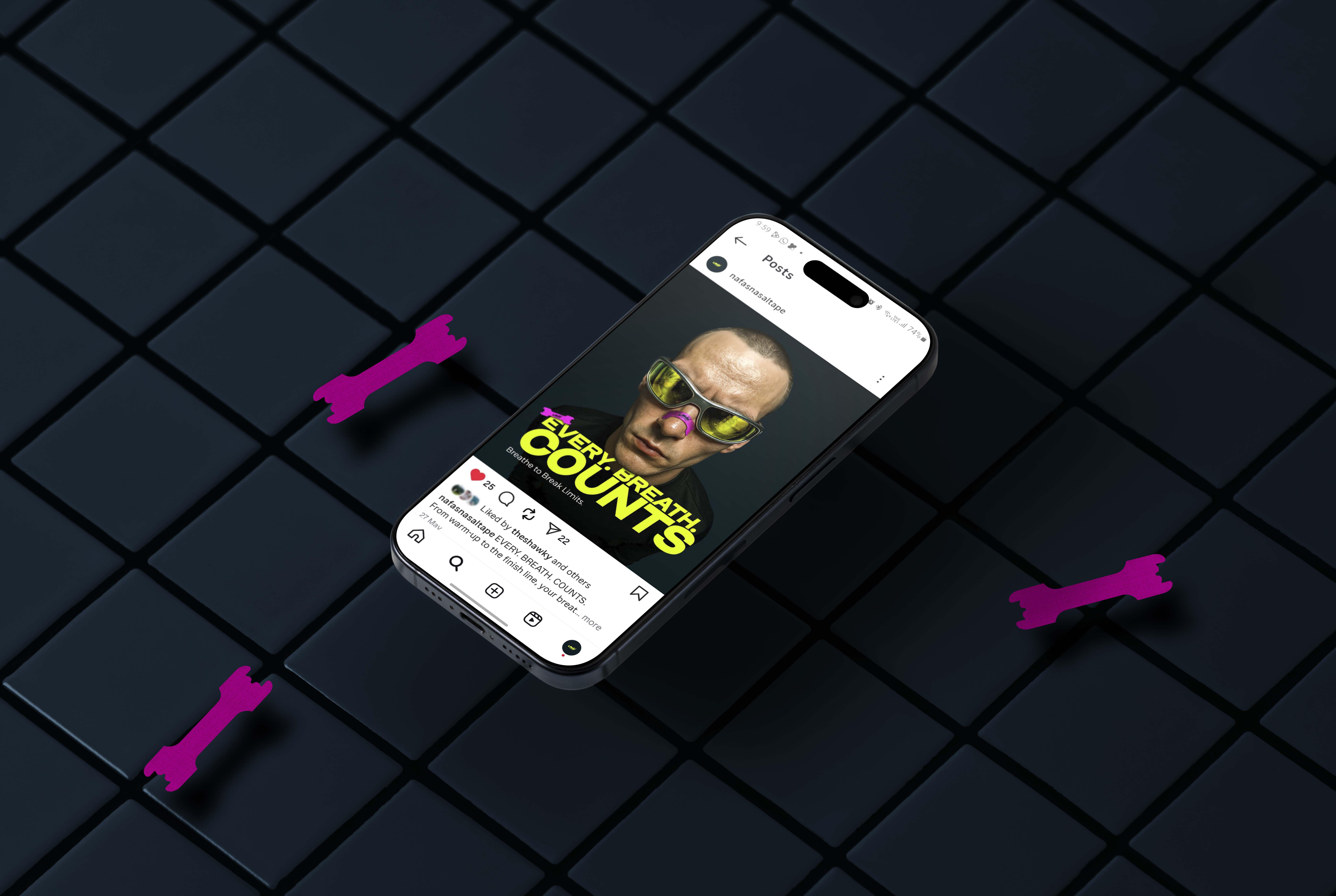
Brand identity for Nafas, a nasal tape made for athletes who want every breath to count. I built a bilingual mark that reads نفس in Arabic and NAFAS in Latin, a loud lime on deep navy palette, and a system that runs from packaging and merch to the website and social, all carrying one line: breathe to break limits.
Nafas means breath in Arabic. The logo writes it twice, in sharp Arabic letterforms with the Latin name tucked underneath, both leaning forward like an athlete mid sprint. The nasal strip itself became a recurring graphic, so the product is part of the identity everywhere it shows up.
Arabic and Latin share one mark, made for a regional audience and a global sport.
Forward slant, hard cuts and tight spacing that feel fast even standing still.
Neon lime and magenta that cut through a crowded gym, shelf or feed.