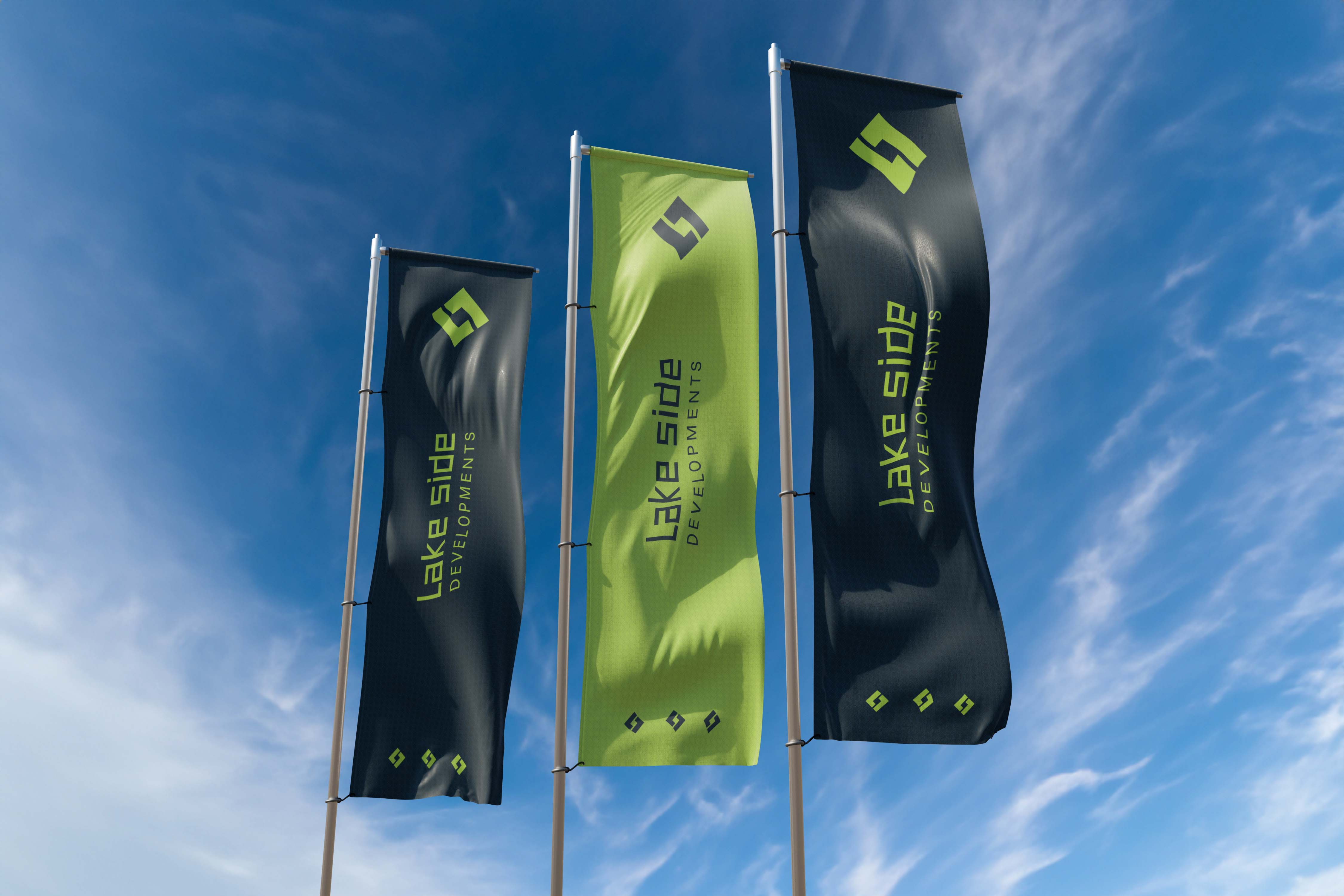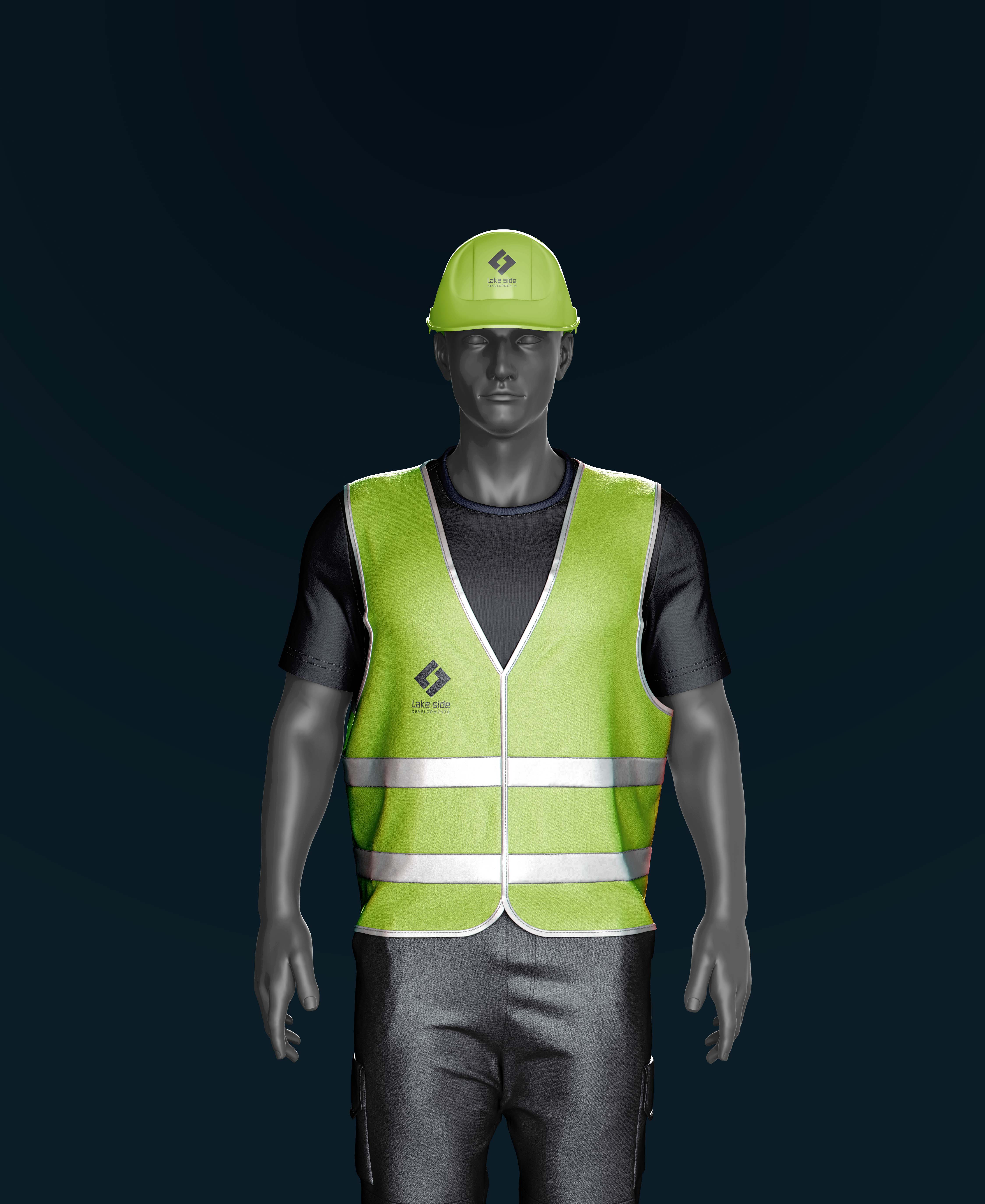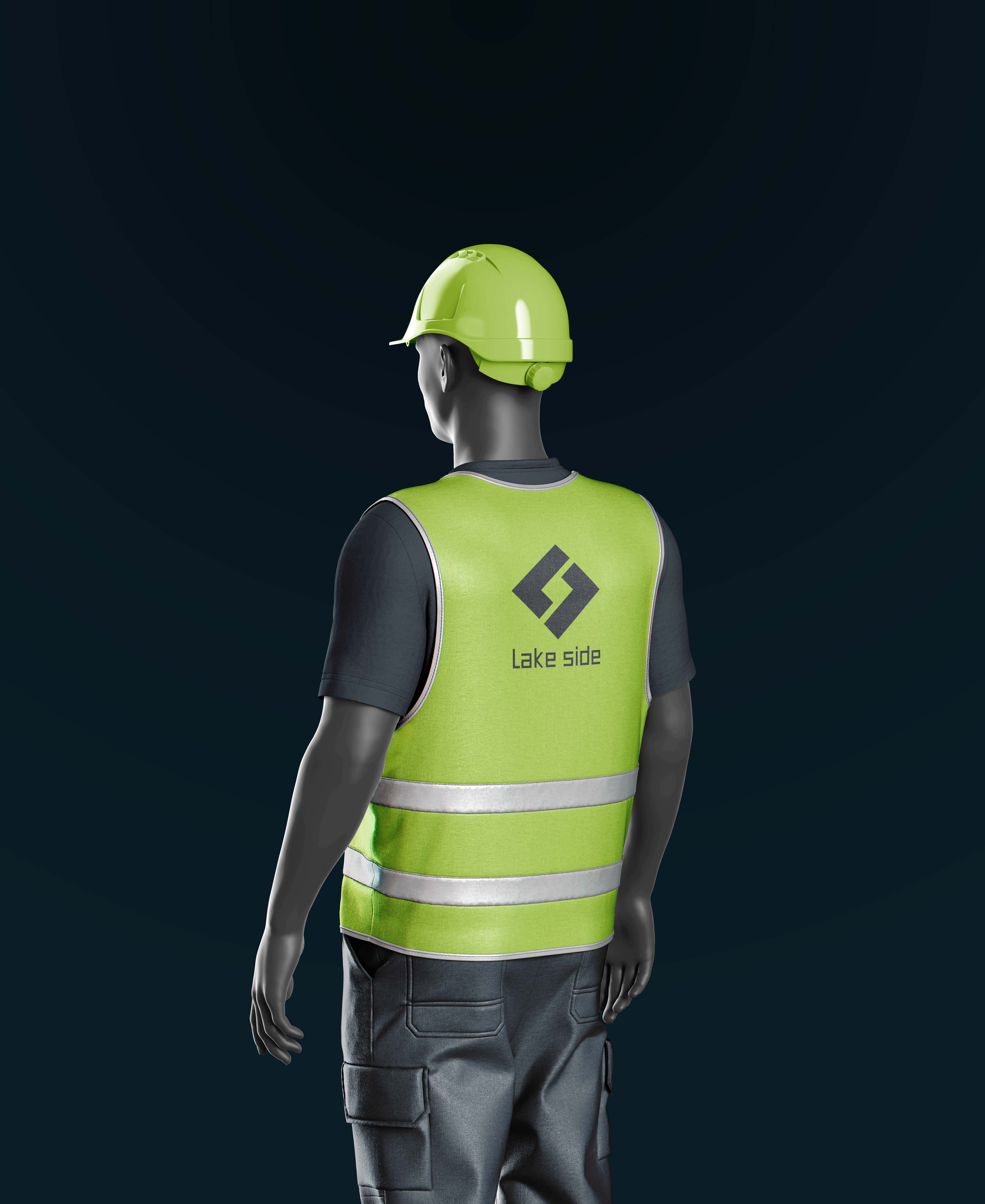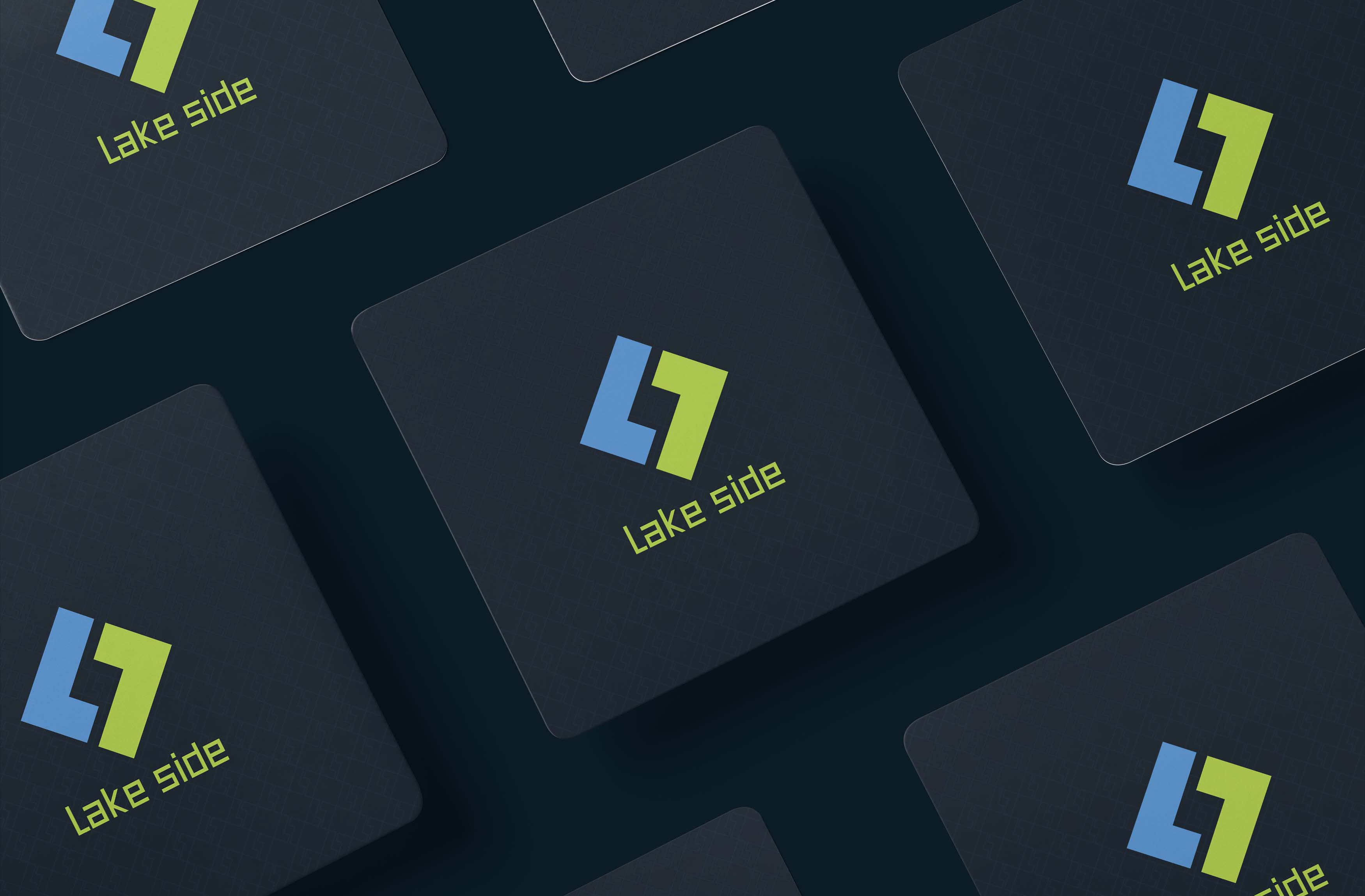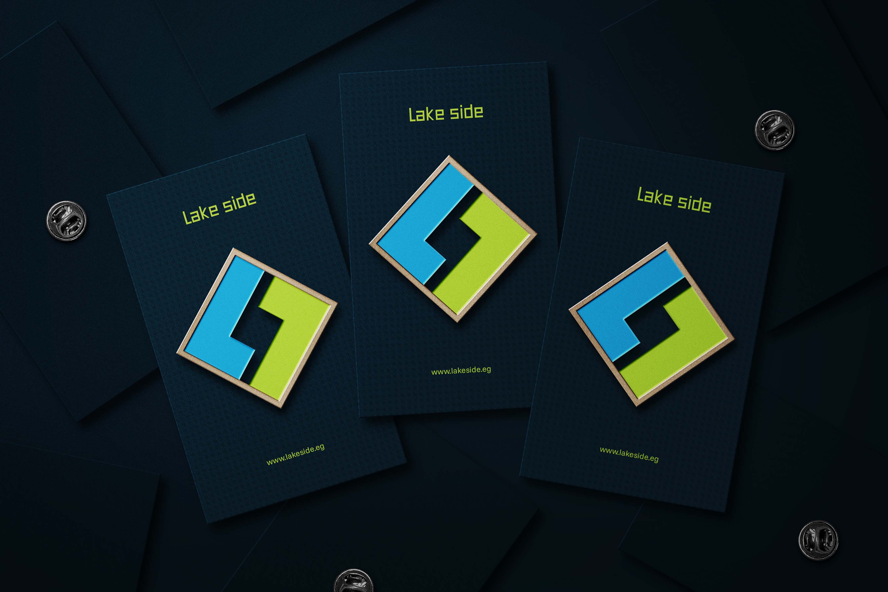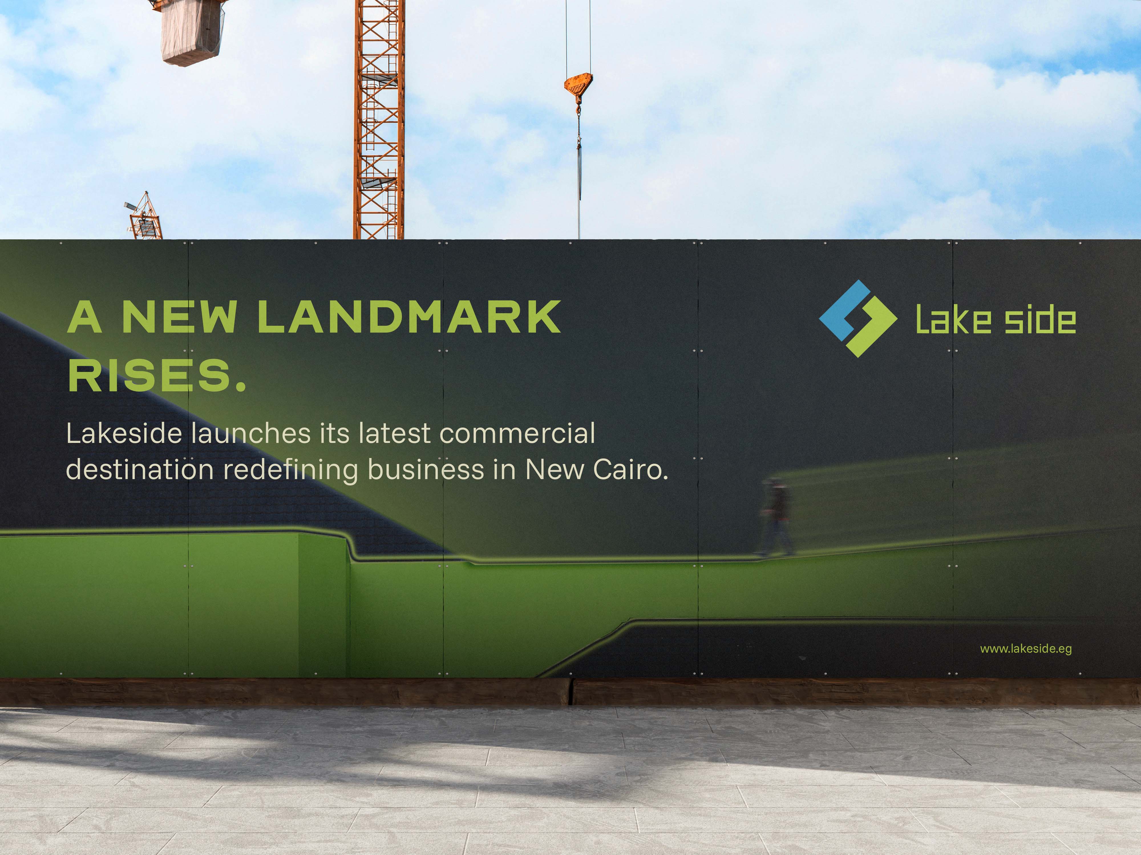
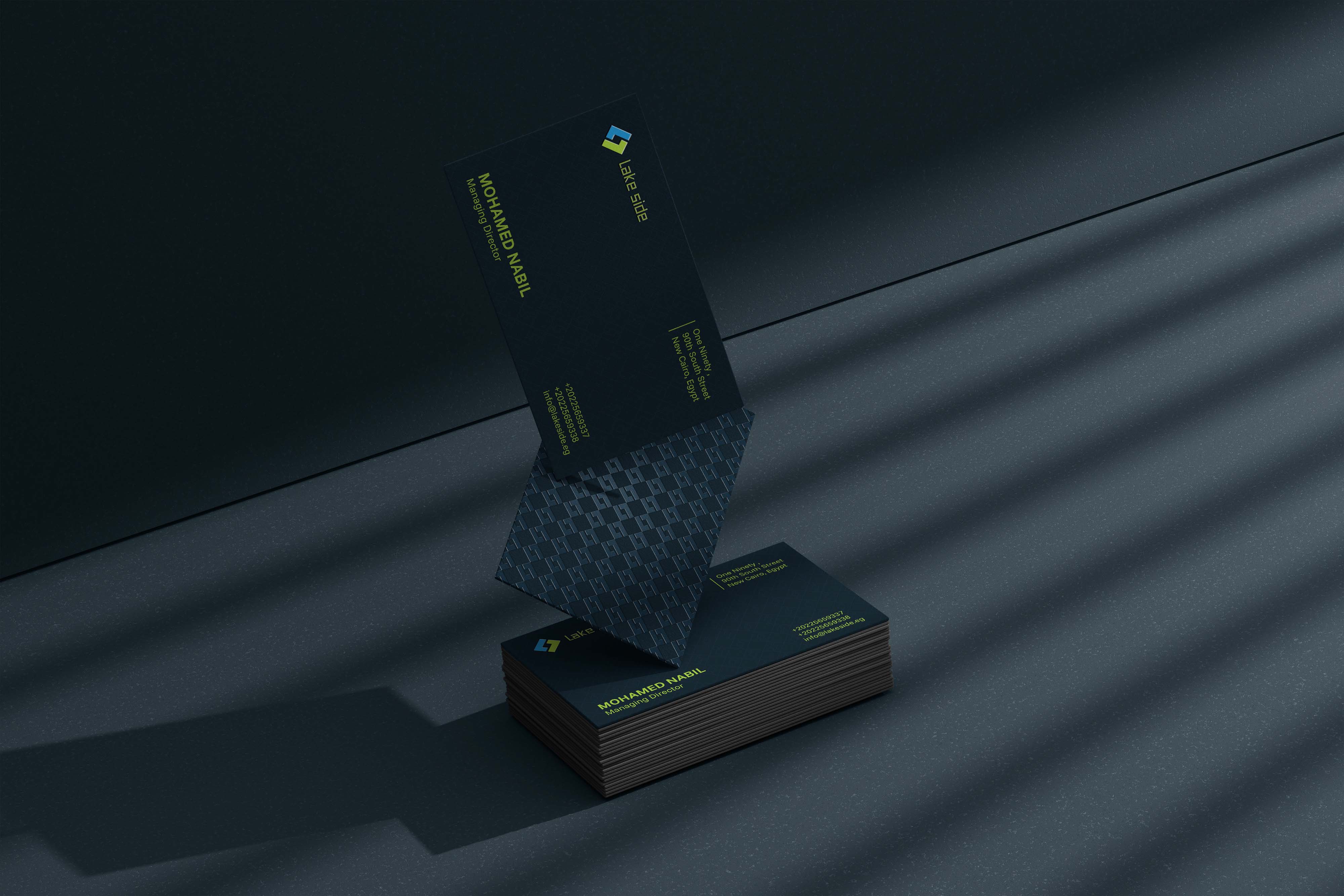
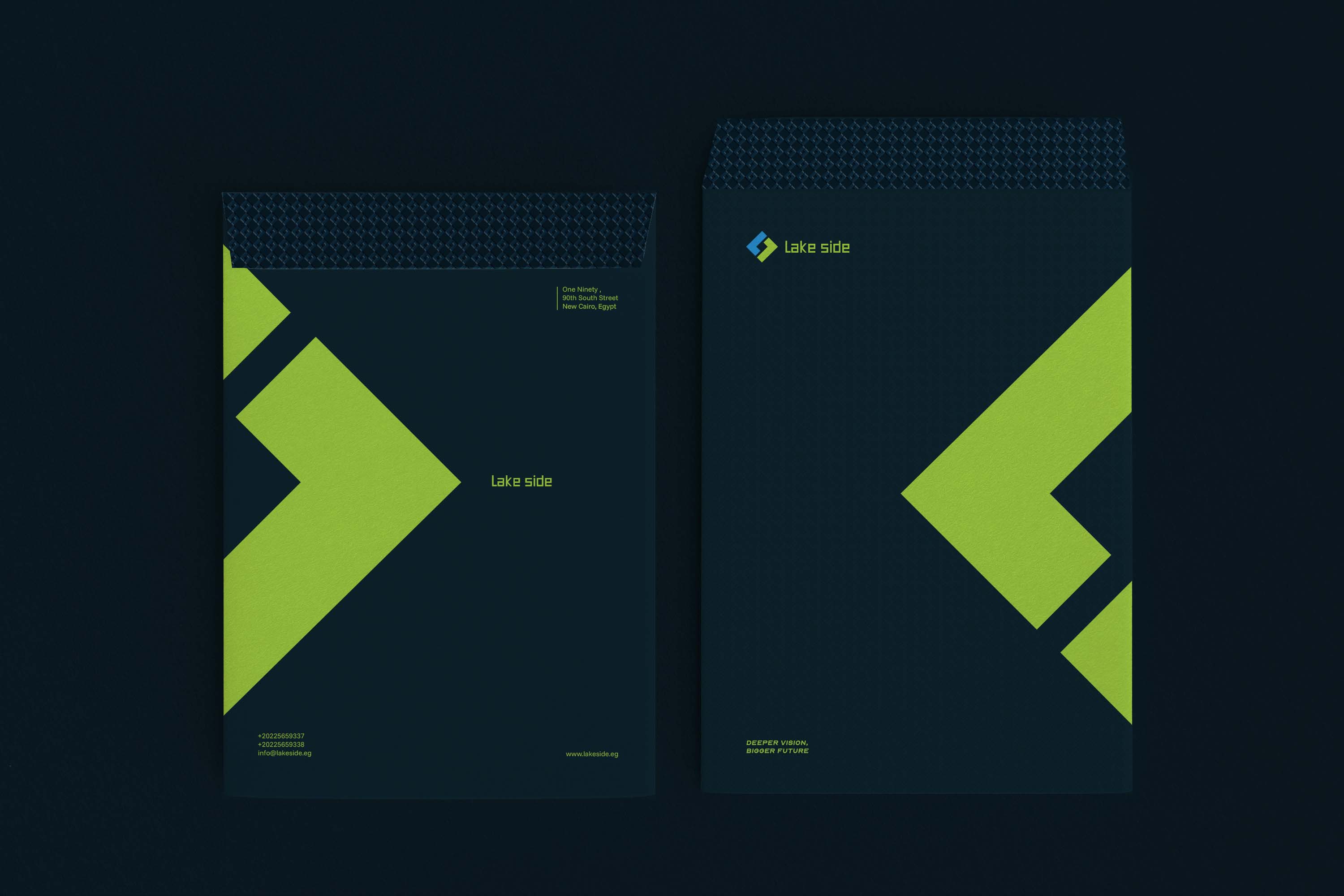
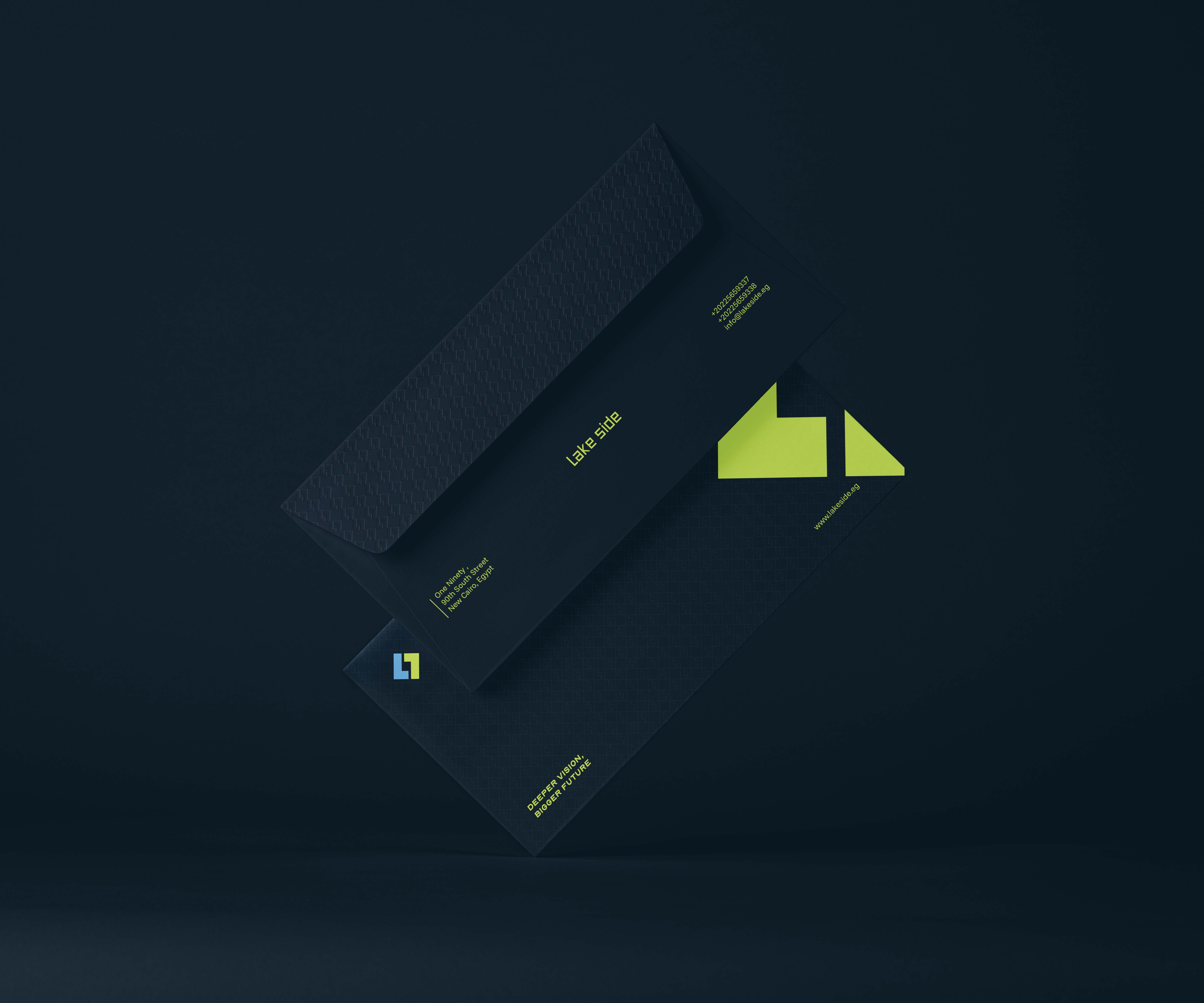
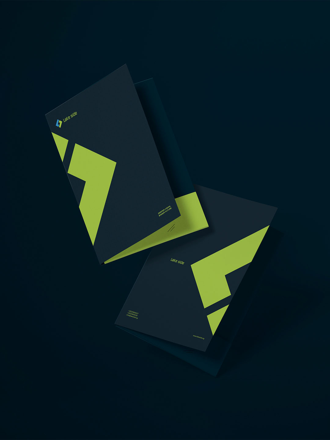
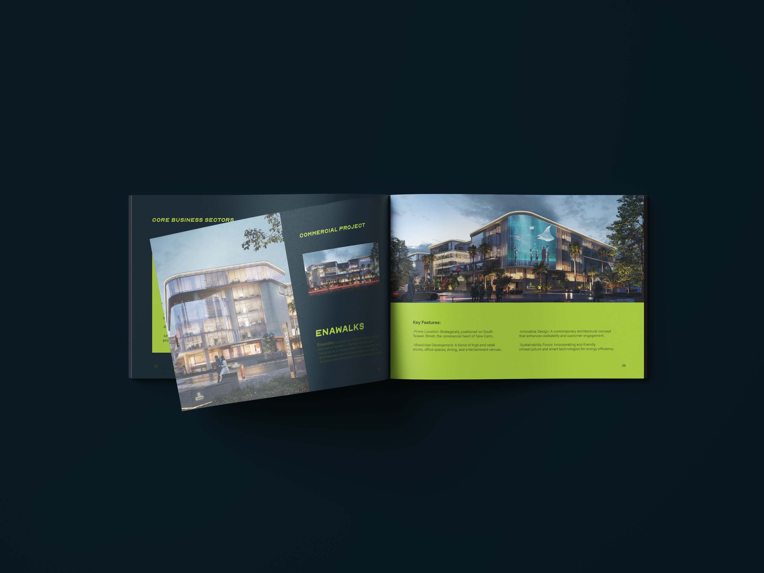
Brand identity for Lake Side, a real estate developer in Egypt that takes over high potential projects and turns them into landmarks of value. I built a mark of two pieces that lock into one solid diamond, a deep lake blue and lime palette, and a system that runs from stationery and print to merch and signage, all carrying one line: deeper vision, bigger future.
Lake Urmia was once the source of life and prosperity for its whole region. I positioned Lake Side the same way: a deep, steady force in Egypt's real estate market that brings value, resilience and renewal to every project it takes on. The identity had to feel just as solid, calm and built to last.
Invested in every project for the long run, with depth as a steady foundation.
Strong backing and a reliable name that gives clients and investors a safe harbor.
Unwavering in its ambition to lead, through every market cycle.